Posted in Creative Strength Training with Jane Dunnewold, Leighton work

editing, and residency plans again

I imagine painters go through this too: “if i cover this area again with white, and start again, i can focus what i want to say, i can change the feel, i can refocus the focus”.

Because i see a big fail here, as i worked on the mountain zigzag area! I want all of these elements to be strong, not strong in that they fight each other and there is no main voice, but i don’t want the story trailing off in a little falsetto either.

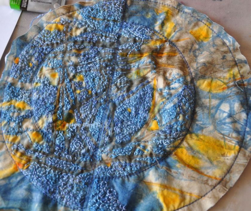
The centrepiece of this is of course the moon. (Background central stitching still be worked.)

moon lines

moon lines 2The roots work.

moon roots

The mountains i have started are NOT, how embarrassing. Because this area was to be cut out and backed, i tried a “colouring” in my photo editing program–i DON’T LIKE IT.

mountain edge maybe

Actually it’s not the intended deep blue i don’t like, it’s those icky mountains. They’re weak, childish, less than what i can do and intended. I think they need to be somewhat similar to the moon fabric i used, a crackly indigo overdyed grevillea ecoprint. Fortunately there is JUST enough of that chunk left, and with fewer light areas–because they do need to be darker than the moon—so i’ll actually be covering that stitching now.

~~~~~~~~~~~~~~~~~~~~~~~~~~

Is art/something/anything better because of the size? Can big be as intimate as the smaller work, the microcosm? Is it scale or portrayal that makes something demand to be large? Can small and dainty be transumed by changing scale and still be a communing with the subject?

go big or go home

One also has to define what “big” means to themselves though: is it actual size, the complexity of the technique used on it, or the point being made using this medium as the voice? Some may even question *my* “big”, but when each element may take 15-41 hours to create, and there are 15 of them to work, well, it FEELS big!

Most of my work to 2011 had been a “comfortable” size, usually within the 20-28″ range. It fit my worktable, it was easily portable, and it was finishable. I started questioning why i didn’t get “expansive and gestural”, feeling limited by the zone where it was easy to fit everything in, almost in a numbered fashion.

Subsequently most of my work since then has been much larger, not only in inches, but in complexity and duration of process. (Pieces have ranged from 30×40 to 36×43 to 40×54) I’ve come to realize i must find a happy medium, both in size and in practice, due to the fact that my work is extensively hand embroidered. I know there is no race or prize for having a certain number of pieces done per year, but when i see only 3 things done over 12 months, i wonder how a body of work can be completed in a reasonable time for exhibits.

I’ve tried doing small exercises that could later be incorporated into larger work, i’ve deliberately set sizes, but in the end, the background fabric determines, literally, the size of the finished piece. Because i was intentionally creating these fabrics for future work, they were larger than the previous comfort zone sizes. This summer i will again be doing a residency to make more of these fabrics, and this time will cut down consciously a few in motif and area so that i have a stockpile of possibilities that are within my zone! This isn’t a limit really, as pieces can always be incorporated into each other if i *do* want to go bigger again.

These are fabrics from past residencies, inspiration and jump off points this year.

feathers-1-fabric

keeper1

feathers-2-detail-c

line-dance-june-29 C


Posted in Leighton work

borgle, borgle, borgling, part 2

I do love this technique for adding dimension and movement to the cloth! I realized when the moon area was done, that these lines would have to be done before the side mountain areas, or the distortion was going to be quite wicked.

moon roots

Because there has been some serious draw-in from this method, i think my stretcher is going to have to be custom built for mounting it when done!

march 2 plan

Though i know what the main elements are, i haven’t decided how yet to treat the void areas of the background. Considering that the original inspiration is a flat batik with no actual texture, it’s a brainstormer coming up next.

Posted in Leighton work

mooning along

moon step background 1First steps taken on adding elements to the background, today will see the enhancement stitching and squaring up. This one will also be more textural than previous work. Still major sections below and around to work on too!


Posted in Leighton work

mooning

Ahhhhhhhhhhhhhhh, better than any sun kissed steely buttocks 🙂

moon done stitch

moon done shapingThis weekend will see it attached to the “borgled” rust circled area on the background.

Taking a it too long to get things done, not because of any intricacy, but because life keeps intruding!

Posted in Leighton work

processing process

This morning i realized i had better look at the big picture with the Leighton work, and really SEE what was going on. As i’ve mentioned before, when you do intensive hand work, you get rather myopic and can’t see the forest for the trees (or the other way around, i can never remember which as both make sense…).

The first thing i did on the background though was anchor the spot where the segmented moon will go. I don’t usually do this step before i “borgle”, but i need that (almost) perfect circle to be stable enough to get the boning in and to hold steady the moon itself.

centre for borglingThen i tried a couple of layouts with some blocking:

first layout blockingNope. Too squared off, though those solid blocks of indigo below the moon won’t actually be rectangles.

second layout blockingBetter, but now as much as i love that river strip, it doesn’t “work” within the context. I decided it will be a piece unto itself, as narrow as it is. I’ll back and stabilize it, probably have to weight the bottom too, to make it hang “straight”.

third layout blockingMmm, yes, better without the river strip, BUT now how do i deal with all that space down the side? For this one, i don’t have the usual option of “filler” in the form of personal iconography (bees, honeycombs, roses, body parts). Do i run another strip down the side of some other stitched enhancements?

final layout blockingWell then, TRIM IT. It’s not essential that it stay the background size i started with.

This was the first plan, not something i was entirely happy with, but it was a start.

original plan sort of

And what i realized i really wanted to do:

final blocking plan

Completely different from what i originally was going to do, but this one feels right. We are after all, supposed to be “inspired” by, not copy or emulate precisely. More borgles, a vertical orientation (for whatever reason i am more comfortable with this than horizontal–i wonder if there are any studies on the reasons people prefer one over the other???),  more of the dimensional fabric manipulation and definitely more personal. Those colour blocks of indigo will actually be behind some cut out areas again.

I can breathe again, now that i am on the right track. A long calendar lead is helping this time—i realized that i just can’t make things to fit within the parameters of some exhibits, whether it’s the size, the subject matter, the technique or the colour (fffff!), but this time i’m flowing and floating with it, and perhaps that’s because it’s a subject/feeling i can empathize with.


Posted in Creative Strength Training with Jane Dunnewold, Leighton work

naked naked–NOT.

Why did i title this one that? Because prurience makes for good blog hit numbers, as evidenced in my stats in the previous post……..Seriously, will you read this ONLY because it mentions nudity?

To the 28th of Feb, the blue moon for the Leighton inspired work looked like this:

moon to feb 28 diff orientation

I also decided i like this orientation better, on the vertical, rather than the horizontal. (Actually the original inspiration is also vertical.) I was also fortunate that the thread i had dyed at the same time as Christine’s hand spun, is almost identical in appearance and weight– even i can barely tell where one ends and the other begins.

As of March 1st, it looks like this. The final stitching in the last arc will be done this evening, and then onto the background. And i have to say that sometimes until i see a photo like this, with all the attendant texture and shadow, i wonder why i am doing things all by hand and so slowly. Well, obviously THIS is why.

moon march 1

I’m quite pleased at how the areas of grevillea ecoprint are accented, but not overwhelmed by the embroidery. And i love that almost granular texture, and am thinking of how that could be strengthened even more, used in other depictions, and wonder how it would be in a contrasting colour. This result is also why i never use a hoop! I feel the fabric is tortured and forced to remain still, unbreathing and static, a condition i cannot see or feel is truly loved. Do we not use fabric precisely because it is alive and soft?

I’m also thinking it might be an interesting experiment to try different weights or weaves of fabric this way—-the stitches may sit higher, or sink the cloth deeper. Scale could be thrown in there as well–how well would this work for large pieces?

And the(yellow/orange) colour added to the indigo overdyed ecoprint–i used to “paint” fabrics to use: why am i not doing more of this? Who cares that one is “Natural”, one “Synthetic”? Would you know if i didn’t tell you? While i doubt i will ever lose my love for the natural processes of rust, ecoprint and natural dye, small doses of colour i can’t do “naturally” (for whatever reason, from cost of material to expertise to conditional recipe), there’s no law that says i can’t mix. I AM a purist about natural dyes–the science behind it IS important to me—but no other art medium is so fraught with “you must not use synthetic/commercial with the natural—it commodifies, bastardizes, cheapens–” and the myriad other Rules set by close minded individuals.

BULLSHIT.

The Dye Police can go to hell. Follow your own rules. I’ll make my own, because in the end, the “average” audience doesn’t give a flying you know what at the moon, what the medium was, as long as they like the whole. And i never understood that “recipe” thing we have to do when we describe our textile work : “hand embroidered with gnat hair, naturally dyed with snipe leaves on organically grown banana skin silk and bathed in a seaside stream, while chanting/channelling Rumi.” On one leg in six feet of snow, uphill facing.

AHEM. There i go again, “defending” myself. But no, i’m not actually: we all have parameters we work within, and these are mine, trying to stretch and fly. WHEEEEEEEEEEEEEEEEE!!!!!!!!!!!!


~~~~~~~~~~~~~~~~~~~~~~~~~~~~~~~~~~~~~~~~~~~~~~~~~~~~~~~

I’m in week seven of the Jane Dunnewold Creative Strength Training class, and have much to think about. Jane’s gentle but insistent style of guidance is the impetus i needed to really look and think about what i do, and why, and how.

Usually i am the student who rushes through things because i know it all already :), but i find now that i am taking time to do the writing, the analyzing (not that angsty kind i’m semi-famous for, though i’m pretty sure that will still come into play once in awhile, truthfully……….) and the internal debate without harsh self criticism. This is not to say intuition doesn’t still come into play: there is no way anyone worth their salt who spends time with cloth seriously, can tell me that Step A must lead to Step B must follow Step A, rinse and repeat. Nope, nuh uh, ain’t gonna work. This isn’t about “giving oneself Permission” either—who died and made Permission the Queen of the Universe? I/we do what i/we do because i/we must–there’s no allowance paid, or diploma handed out for toeing the line—- because Permission is Concession. Either do it or don’t.


On a side note, the body painters almost completely changed their designs. I’m not doing more damned sketches for it: my time is valuable too, and again within defined parameters of the changes, you’ll get what you get. This ain’t no damn game.

Posted in Leighton work

thread notes

christines-2ply-spun-silk

See that beautifully spun silk thread on the left? That was literally hand made by my friend Christine in BC!  (The dime and spool of machine thread are for size reference.) Fine, fine work! I dyed it with some indigo in small dips to create some colour variation, and that’s what i’ve used to date on the blue moon. Alas, i ran out last night and will have to switch to another thread that is fortunately very similar.

moon with christines thread


Posted in in progress, Leighton work

moon stitch

moon stitch commencesChanged my mind about using the sewing machine weight Aurifil for hand stitch when i dropped this hand dyed silk thread near the piece—it’s got a slight variegation going on and being a perle type adds more dimension and glisten. It’s slightly thicker than the original stitch plan, but not enough to lose the details.

I’m still surprised and pleased when stitch is added to a fabric, making it come alive.

moon stitch commences b

Posted in Collision: the work begins, Contextural Fibre Arts Co-operative, journal: lessons to learn, Leighton work

working on while working on

Though i have pulled old work to finish and am excited about that, i am still working on new work to keep the juices flowing, and prevent the stagnation that occurs for me when i work only on one work!

“HAHA HEEHEE HOHO” as the song goes.

The upcoming Leighton Art Centre exhibition is the “big piece” this year (so far). I got a bit bogged down with it and decided to forgo the “companion piece” (“Body of Water”). The figure has a bit of work on her which i am letting puzzle for awhile, but i decided the background she was on is perfect for the actual exhibit piece. (I can always make more blue fabric for her.)

This is the original inspiration:

leighton batik 1 back

I have gone many ways since seeing it last year, with copious notes, sketches and samplings.Riffing off your own work is hard enough, but to use someone else’s deliberately WITHOUT COPYING, is even more problematic. One does not wish to copy, emulate or reproduce, one wishes to “respond”. Blech. In the final analysis, it was the sketch of the parts that fired the stove:

batik sketch C

I’m therefore pretending that the bare bones shapes are mine. How would i translate them into cloth and technique?


moon backgroundThat blue background already has a vague moon shape in the form of a rusted ring. Play off that then.

I made fabrics deliberately for this work, drag ’em out.
crackThe grevillea ecoprint perfectly reflects the batik cracks in the original Leighton cloth.

app moon on backgroundLooks a little dry though:

moon and river on backgroundI used to paint, paint with paint, paint with dye. So paint with some dye:

dyed moonNow it’s juicy. Picks up the colour again of the original.

dyed moon on backgroundI then got hung up on what stitch to use, what colour the stitching should be, where should i put the stitch………

Well, duh. Blue, on the blue sections, and teeny crackle effect as i did on “All Water Under the Bridge” in 2014:

awutb-done-mar-14b-c1For reference sake, those stitches are probably  30-40 per square inch. Using a 20wt cotton was more than myopic but the effect is fantastic.

Onwards and upwards. On March 12th, the participating artists are going out to the Centre again to again review the originals. Think i’ll take this moon piece with me, there’ll be some stitch done on it by then–not going to let the original scare me, just want to see how approximate my take is without being too much of an approximation!


Posted in a collusion of ideas, journal: lessons to learn, Leighton work

well, *that* bored me to tears

Couldn’t cut, couldn’t pick up a needle. Crap. I was forcing myself to do something that isn’t me anymore.

But i’m looking at this again:

in flight sketchesTHIS is where i need to start.

So i did this from the photo of the Leighton Fabric:

batik sketch CI’m also thinking now, that while i will not (would NEVER) “copy” Barbara Leighton’s work, there is a way to jam off the shapes. I could change the orientation, the scale, the colours, and certainly the medium treatment, as i am not replicating a batik process. Even this sketch from the main shapes is subject to interpretation, morphing and distortion. I could cut it up, duplicate areas, cut out sections, move them around, ignore some pieces, soften lines even more. (Thanks Karin, for all your “L frame” tips over the years that apparently sank in after all 😉 I miss our coffee times, Scamp!!!!!!!!! )

After all, what is it that draws me in the original piece? The shapes are organic, the colours are softer, more muted as natural dyes would be. (The original is Procion.) I don’t necessarily mean to use all natural dyes either–which means searching the current fabric stash is rather frustrating, as i am finally at the end evidently of all the pieces created in residency, neither do i have many solid colour fabrics. I’m eyeballing that black Pima (previous post) for some more discharge and overdye tests.

Because this is what i really want to do:

c-arlee-barr_winter-prairie_detail-viewI miss my Frankenstitch. I’ve done bits of it over the last year or so, but it kind of went by the wayside as i started adding dimension by using separate pieces. Time to add it back, and to that love of dimension.

So, it’s time to pull out the black pens, graphite pencils, crayons and paint —- and start colouring.