Coming, coming, coming, soon i promise! Still fondling and sorting these silk velvets, trying to decide what colours should go together! Tell anyone who says “natural dyes are boring old browny beige blahs” that they are SO wrong
I hope to get packs in the shop by Friday evening, and yes, these will be included in the current sale. There may even be some scrap packs of these! SEVEN PACKS NOW LISTEDÂ Â SOLD OUT
Category: Not so ordinaries
purple
more lightfastness notes
Made in 2013, “The Difference Between A Plum” has travelled a lot of places, without due care as to light conditions. It’s been in well lit galleries, dim areas, fluorescent light, daylight and gawdz knows where else as it made the rounds to various shows. While it’s hard to “match” photos for colour truth, i think these are both very true to the colour it was when made, and the colour it is now.
Iron was integral here as a mordant. Iron deepens and “saddens” colours, can shift to deep purples, blues, garnet, greens, greys and browns, depending on the dye used. (In this case, brazilwood.) It can weaken fibres as well, if the concentration (know as WOF, or weight of fibre ratio to mordant/dye) is too high. I’m pleased to say the fabric still seems quite strong, despite the heavier rust concentrations, though of course, i’m not swinging from the chandelier to test the fact 🙂
Brazilwood is NOT a good dye for lightfastness, though it holds up well to wash fast tests. (Great, you can only wear it in the dark, and wash it in dim light….) BUT surprisingly, this piece is not that different from when i made it six years ago.
Left, the original photo taken in 2013, right the photo taken today:

It is noticeable, and yes, 6 years is not that long, BUT i’m still quite happy about the effect time has had on it.
I definitely wouldn’t advise this for clothing that would be worn a lot, or an art piece in a very bright room, but as an artpiece, the evolving colour change is interesting. I wonder how much lighter it will be in another 6 years, or is there a point where residual colour stays?
on a roll
round and round i go, with ideas abundant, colours singing, and natural dyes that sing sing sing
these mini moons are not only an antidote to blue days, SAD and the Black Dog, they are fun to create!
Happy Solstice to you all!
EDIT: PS:
Sad. I’m sad that someone would email me and tell me i’m obsessing about my little moons. Damn right i am–i’m not depressed, i’m not angry, i look forward to getting up in the morning, i’m loving colour, i’m working in my studio EVERY day, i am doing what i need to. We all need to find what makes us happy, productive, engaged and feeling positive!
So, now i am NOT SAD myself ![]()
They sleep eternally, that we may still dream.
The first Green Goddess
animal house
I’ve often mentioned that our backyard is a wildlife corridor of sorts, and a refuge as well. This whole month has been a pleasure as the animals prepare for winter, grab snacks and rest. All photos are clickable for enlargement.
During the snows, at the beginning of October, the “bird cam” was very busy:
They rest in the raspberry bushes as well (top right side by patio trellis). And soft hearted as i am, i have a little “greenhouse” outside on that patio, that you can’t see in these shots, that i have covered with landscape cloth and some plastic, set cut apple branches in and various tipped pots, as they often shelter in there during bad days. I thought they may as well be comfortable! The raspberry bushes become denuded, as they are the last leaves to be eaten by the deer 🙂
The deer visit regularly at night, usually a Mama and her two babies, though Greyman unsuspectingly walked out late one night, and just about into the butt end of a buck!
The last week has been quite busy! Mama is getting ready for Halloween 🙂
We missed the shot of Billy trundling by them, on the way to the apple tree! They barely moved, as i guess they’ve seen him often enough 🙂
The apple tree is a favourite of Blondie and Milton as well. (Milton is too shy to have his picture taken.)
And then there’s Billy Idol. We had been told a few years back that there was a porcupine in the neighbourhood, a big old boy, but last year, Billy showed up, and due to his size, we figure he’s a young descendant of Spike.
One night last week, i chanced a look out the window in the wee early hours, and saw this:
This is the crucial photo, but alas, the camera didn’t catch when he fell off the top of the fence, and lay there stunned for a few seconds! I wanted to run out and check him, but how does one pick up a porcupine and set him back on his feet?????
And last night, we discovered that porcupines can really really climb! The apple tree is at least 20+ feet tall, and here he is, at about 15 feet, munching on apples.
He’s actually a rather mellow fellow, no threatening noises or bristling–though i wouldn’t test him cornered, on the ground–and fortunately DogFaced Girl stays well back when he is in the yard, with her just sounding the alarm.
We still haven’t, and probably never will, have moose, bear, cougar or bobcat in the back40, though i’m sure if we weren’t as far southeast from the mountains and plains, that we would see them at some point!
Welcome to the Barr Home Hostel and Buffet for Wayward Animals 🙂
(Our first experience with Billy is here.)
“Love is the Answer” project, part 2
March 7/18:
(As i mentioned before, these entries will all be posted when my part of the project is done, but are dated at the time written. For reference to previous thoughts, see Part 1 and posts following this one by clicking on “Love is the Answer collaborative project” under the entry.)
Most of us have a personal symbol system, whether motif, shape, object, colour or even stitch, that marks our work, makes it ours and is ultimately satisfying. Mine are anatomical (hearts, brain, spine/bones) or nature inspired (bees/roots/branches/moons), and the hexagon shape, quite ubiquitous in a lot of my work. Hexagons, in my lexicon, are cells, microscopic flora and fauna, hives, memories, all symbolizing at a basic level, connectivity.
While most of my personal symbols would probably work within the context of this collaborative project, i feel the heart and hexagons would be the most appropriate. Heart and connectivity are most definitely parts of love, in all of its platonic, romantic, pantheistic and spiritual permutations. It’s these components that make it work, in my books. And that is where Respect starts, as Love is Respect.
For this, i wanted to use the really abstracted drawings of the way the heart’s “electrical” current flows. This was a pre-cursor to that (from 2006!).

I had started a new project/idea in January of this year (after correcting the placement of that left side hand!):

Went nowhere with it….
BUT. Those hands and what about with an abstracted heart?????
I liked this sketch,

and thought to make it a bit more story telling, a heart’s current over the entire world. (This is a somewhat artistic rendering of the actual heart current, abstracted and more ornamental, but it does represent the real thing. Because i have heart issues, i do a lot of research 🙂 )
Sept 29/18: A version of that sketch will go on this:

Oct:Â Â Â And i finished the “back” for this pennant, though i suppose there is no front or back, no “right” or “wrong” side to this project, as Mo is suspending them from very evocative armature.
“Love is the Answer” project, part 1
March 5/18: (I decided not to publish any of these until i had a certain amount of work done on my part of the project , hence the date at the beginning of the post. You might have seen some of the drawings/work though in previous to this project posts 🙂 )
I’ve been a long time follower/reader of Mo Orkizewski (Mo Crow) at her It’s Crow Time blog in Australia. I admire her spirit, her ethics, her art and her outlook on life. In June of 2017, she conceived a project, based on a line from her equally talented partner’s song “I Dream of a World”, that has become a hugely collaborative art installation, slated for display in 2019 at Artsite as part of a show entitled “Braille for the Soul”.
Now, long time readers will know that i “hold no truck” with arty proposed “solutions” to world evils, from folding paper cranes for Paris’s Charlie Hebdo tragedy, to prayer flags for whatever cause, or “craft for peace” days. It’s not that i think groundswell movements can’t change things (because alas, our sad world has so many problems), but that people use these as excuses to pay a moment of goodytwoshoes my piece about peace is more important than your considered opinion and actions about HOW to/that do actually make things better for SOMEONE.
*My* answer usually is go small, be small. Contra-indicative? Nope. Because i/you will never stop any of the depredations that man commits upon man, that man commits on the world, on Mother Nature, on women, on children (and by “man” that’s the generic human species, not specifically the male sex–though given the current climate in the US happening right now with the confirmation hearings, that’s a debate well in fury right now…..), by practicing origami, hanging rags on ropes in a breeze, or blessing fabric in the sea. Going and being small does not mean either that one is selfish–i mean go small, be small, as in sharing what you have with someone who truly needs, in your own part of the world. It is a small thing on a global or universal scale, but it helps someone/something immediately. Prayers don’t fill bellies, warm hands in -40 temps, or show any true kindness. Be small when you volunteer, donate give ( i don’t like the word donate with all its connotations of old clothes that don’t fit, or that you had enough money to mis-spend and really don’t care, or a 20 dollar bill once a year in the Salvation Army kettles because you feel guilty and seasonally magnanimous at the same time…), help, compliment, show respect, share gloves and scarves, a sandwich and coffee, a five dollar bill to someone scraping for busfare or cans in the trash, hold a door, pick up someone who has fallen on the ice, because small is big for some. If you can make ONE day better for ONE person, doesn’t that say more for your humanity and soul AND theirs, than all the frickin’ paper cranes in the world???????? And maybe THAT person is the one who DOES change the WHOLE world.
Off the soapbox. So WHY then would i contribute gladly to a project like this? Because to me, this one does say something–it’s the joining of a lot of viewpoints from around the world, expressed eloquently, calmly, lovingly and full of hope and concern, with intent, expression and heart that goes beyond slapping some felt letters on a scrap or finding the prettiest paper at great expense to torture into a symbolic shape.
So within the context of the show, what does “Love is the answer” mean? Love, true love***, whether platonic, romantic, pantheistic, or spiritual is, on a broader truer scale, about respect. It does not use apologies as manipulation, is inclusive, does not contrive, never obligates, does not keep a ledger. Love guides and supports, connects and strengthens, complements, enhances and shares. Love is moral, thoughtful, questioning but not aggressive, does not judge, is constant and patient. Love is not guile or a weapon. I re-iterate: Love is Respect.
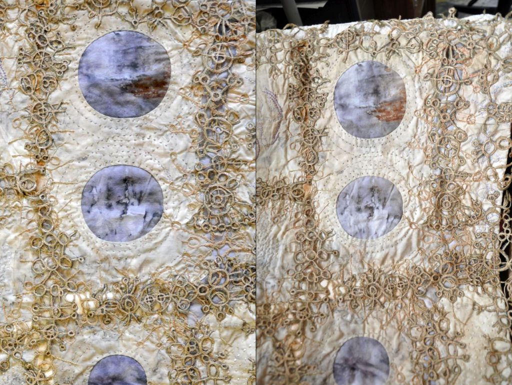
So, anyways, off the box again 🙂 Mo sent me one of the “pennants” to do with as i wish. (The fabric is from a very old wedding dress.) I took it apart first, as the layers can be re-assembled when the work is done.

I did an alum pre-mordant, assuming the cloth was silk, but there was no madder dye uptake, then realized it was a synthetic after a burn test spattered some on one of my fingers! Then i spent two weeks dithering about what i was going to do next, staring at it, shuffling bits on and off it, having multiple “Eureka” moments that withered very very very fast, and thinking i was going to completely ruin it —–and Mo was going to politely say “oh that’s interesting” while privately wondering why the hell she had sent the original to me at all…….
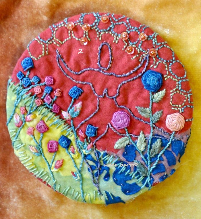
This will be a layered process, something i have done before, but not a lot lately. Building dimension and story this way means the elements won’t be fighting each other. This is the “first” layer, though in the end, it’ll be the background, and not all visible. I deliberately stitched some areas so that they looked as if they were fading, rubbed out. (Unfinished at time of photography.) Not only is negative space important, but it will be more effective once the next layers go on.
Greyman thought i was embroidering him a wide tie 🙂 , but *his* choice of words would have been quite different!
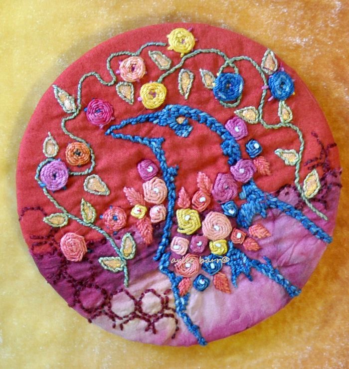
July: A mock up for part of the front, still being worked:
August: and good progress on the back, as of the middle of August:
Stay tuned for “part 2” and maybe one more: one post would be waaaaaay too long!!! And of course, an “Artist Statement” 🙂
“Love, true love”*** does momentarily give me a giggle as i remember a particular scene from “The Princess Bride”…..
just a day
Here’s proof that pink calms dragons as well 🙂 He then flew onto my shoulder to say hello, before he went off on business.
How can one ignore inspiration from one’s own garden? It wasn’t just the yellow shouting of these Ligularia flowers, it was the indigo shadows underneath as well, due in part to the smoke still hanging here.


You must be logged in to post a comment.